Axure is a well-known prototyping tool with a lot of history, it has been around for years. You can create almost any kind of prototypes from simple ones to more complex ones with variables and logic without writing a single line of code (well, when dealing with the complexity you will need to write some expressions).
Prerequisites
First, you need to have Axure installed, if you don’t have it then simply head over axure.com and download the latest (trial) version.
Axure is available for Windows and Mac, so choose the appropriate version to download.
If you are a little bit familiar with Axure (even with older versions) you know about widgets, interactions and cases then you are on the right track, if not, you should still be able to follow the steps in this tutorial.
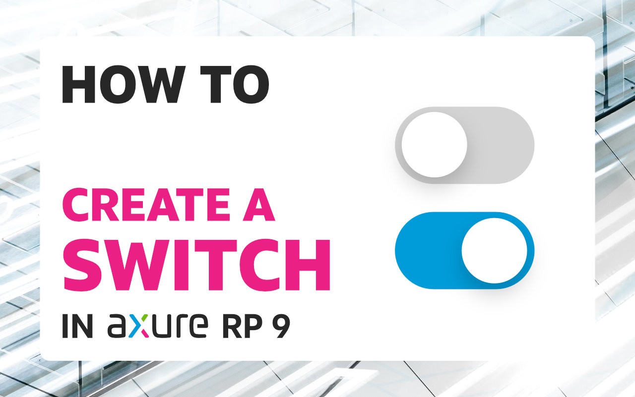
What we will create
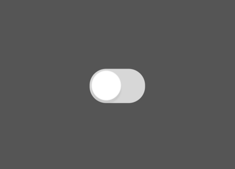
In this tutorial, we will see how we can put together a simple switch (a very well known input control pattern) used in mobile or desktop UI. The important part to this component is the interaction (the on/off toggle interaction).
If you want to learn more about this control type you can take a look at the Apple HIG here: https://developer.apple.com/design/human-interface-guidelines/ios/controls/switches/
To make everything work(on the interaction part), we will use a little bit of logic to respond to the click(or tap) event in order to toggle the switch (but we will not gonna use variables for this).
The reason for not using a variable to handle the toggle state is because we want this component to be self contained (without dependencies) to be easily reused across projects.
Step by step instructions
This tutorial is quite simple and it has only 2 steps.
Step 1 — Building the necessary shapes
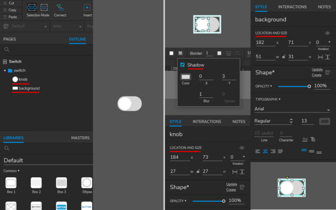
First things first. Let’s create the basic shapes by dragging 1 rectangle and 1 ellipse on the canvas area. The rectangle will be the background (so we can also rename it to background) and the ellipse will be the knob (also rename it to knob).
For these to shape I’ve used the following settings (see below) and at the end I’ve grouped them (and renamed the group to switch).
If you don’t have too much experience with Axure shape widgets then you can read more about them here: https://docs.axure.com/axure-rp/reference/shapes/.
Shape properties:
Knob:
- Width/Height: 27
- Fill: #FFFFFF
- Shadow: fill: #000000, opacity: 6%, x: 0, y: 3
Background:
- Width: 51
- Height: 31
- Fill: #D7D7D7
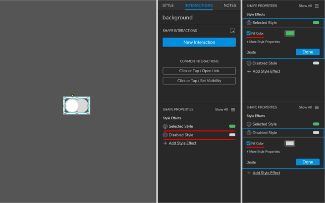
For the background shape I’ve also set up 2 style effects (selected and disabled) using the Interactions tab.
Step 2 — Adding interactivity
Now, that we have done the basic setup and have all the shapes we can move to the interactivity.
We will add the interactivity on the group object (this way we can respond to the group events) on the click(tap) event.
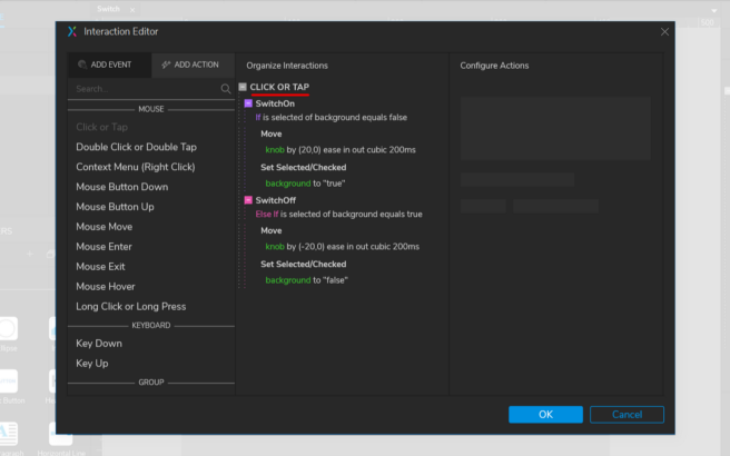
See the image below (with the Interaction Editor) where I’ve added the interactivity (don’t worry if it looks complex, I’ll explain what is happening).
So let’s break this down.
I’ve added an interaction on the Click(tap) trigger (so this is the click/tap event). To add an interaction make sure that you have the switch group selected and on the Interaction panel click on the New Interaction button and select the Click or Tap trigger.
If you are not really familiar with events, actions, cases you can read more about them on the Axure website https://docs.axure.com/axure-rp/reference/events-cases-actions/.
Now, as you can see on the image, we have 2 cases named SwitchOn and SwitchOff and each of these steps have some actions.
1. SwitchOn case.
To add a case just click on the Enable Cases button for the Click(Tap) trigger in the Interaction panel. Clicking on the Enable Cases will open the Condition Builder dialog, this is where we can build our condition and run a set of actions if this condition is evaluated as true.
See the image below with the set up for the condition.
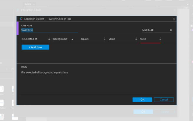
As you can see we will check if the background selected value is false. If this happens it will run a series of actions (see my previous image).
Here are the actions:
- Action Move (basically we will move the knob on the horizontal axis from left to right by 20):
- Target: knob
- Move: by x: 20, y:0
- Animate: ease in cubic: 200ms
2. Action Set Selected/Checked (we set the background selected value to true):
- Target: background
- Set: value
- To: true
This is it, let’s now move to the SwitchOff case.
2. SwitchOff case
The SwitchOff case will be quite similar with the SwitchOn case with 2 small changes.
One change will be on the condition, see the image below.
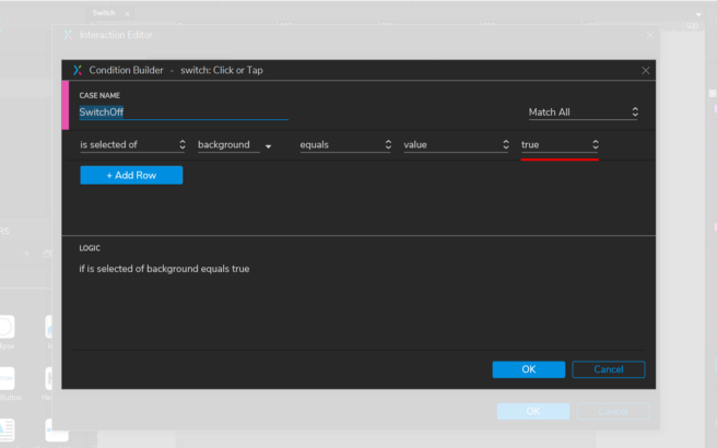
As you can see the condition is the same, except we check if it is true.
So if the condition is met then we will execute the same steps as on our previous condition with small changes.
Here are the actions:
- Action Move (this is where we move the knob from left to right with a negative value by -20):
- Target: knob
- Move: by x: -20, y:0
- Animate: ease in cubic: 200ms
2. Action Set Selected/Checked (we set the background selected value to false):
- Target: background
- Set: value
- To: false
This is it.
Creating a switch UI component in Axure is relatively easy with just one simple interaction in a group. Now, we can enjoy our new switch component in future projects. You can also download the Axure file from here: https://hi.switchy.io/1O4f
Original post you can find here: https://uxdesign.cc/how-to-create-a-switch-in-axure-rp-9-f42060d99b1a