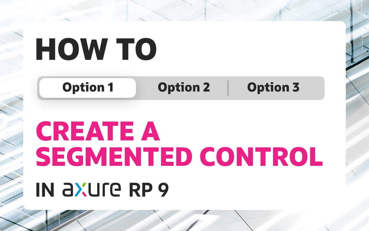
Segmented controls are not very easy to tackle in prototyping. This is especially true when you have more than 2 segments. This article will show you how to create a segmented control with 3 segments in Axure in just 2 simple steps. The technique can be applied for any number of segments.
Ready? Let’s begin!
Prerequisites
To follow along, you’ll need to be a little bit familiar with Axure and have some understanding about widgets, interactions, local variables and expressions.
Also, if you haven’t done it yet, you can download Axure latest version from Axure Website.
What you will create
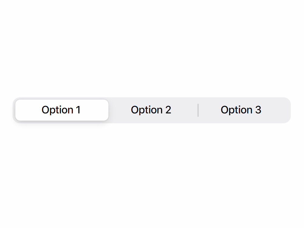
You will create a segmented control (a very well known input control pattern) used in mobile or desktop UI. This type of control allows the user to switch to a specific option within a group. If you want to learn more about this control type you can take a look at the Apple HIG here: https://developer.apple.com/design/human-interface-guidelines/ios/controls/segmented-controls/
To make everything work(on the interaction part), we will use a little bit of logic to respond to the Click or Tap event in order to change the selected option (but we will not gonna use global variables for this, instead we will take advantage of local variables).
The reason for not using a global variable to handle the selected state is because we want this component to be self contained (without dependencies) to be easily reused across projects.
Step by step instructions
The level of difficulty is easy to medium. Everything was broken into 2 steps so you can follow along more easily.
Step 1 — Building the necessary shapes
In this step we are going to create all the necessary shapes for our segmented control. To see an overview of the shapes and structure take a look at the image below.
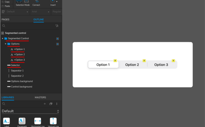
Basically, we have only one group called “Segmented Control” and inside we have:
- “Options” group — In this group there are all the options for this control, these are named with the “+” prefix to indicate that will hold the interaction (in the next step)
- “Selector” — this shape indicates the current selection
- 2 separator shapes (Separator 1, Separator 2) to separate the segments
- “Options background” — this is the gray background that makes the control to feel like one shape
- “Control background” — out control background for the component (can be optional)
If you don’t have too much experience with Axure shape widgets then you can read more about them here: https://docs.axure.com/axure-rp/reference/shapes/.
The “Options” group is actually made of Label Widgets and the way they are laid out is to overlap a little bit the boundaries of the separator shapes. These boundaries are set up in such a way that can be used to determine the left and right limit for each segment.
Also, notice that the “Selector” sits under the “Options” group and it has a wider length.
See all shapes properties below.
Shape properties (of course you can adjust these properties to fit your needs):
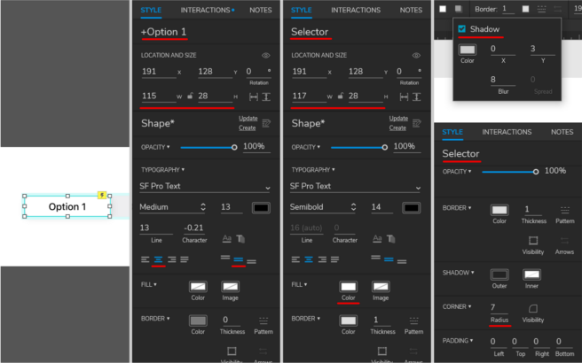
Options (+Option 1/+Option 2/+Option 3):
- Width/Height: 115/28
- Fill: none
- Shadow: fill: #000000, opacity: 15%, x: 0, y: 3, blur: 8
Selector:
- Width/Height: 117/28
- Fill: #FFFFFF
- Border: 1, fill: #000000, opacity: 4%
- Corner: 7
- Shadow: fill: #000000, opacity: 12%, x: 0, y: 3, blur: 8
Separator (Separator 1/Separator 2):
- Width/Height: 1/16
- Fill: #8E8E93
Options background:
- Width/Height: 343/32
- Fill: #767680, Opacity: 12%
- Corner: 9
Control background:
- Width/Height: 375/44
- Fill: #ffffff
Step 2 — Adding interactivity
The only interaction that you are going to add is on the +Option(1/2/3) widgets on the Click or Tap event. Basically, what you need is to move the “Selector” shape on the horizontal axis to the left bound of the widget that triggered the event.
You are going to add this interaction only on one of the +Option widgets (in this case +Option 1) and using the copy/paste function replicate this interaction on the rest of the widgets +Option 2, +Option 3.
As you can see it is really easy to add the interaction to new segments all you need is to copy/paste the existing one.
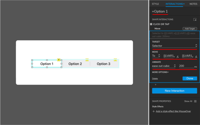
To achieve the required interaction (basically to move the “Selector” widget to the appropriate position) you will use some expressions inside one action with the following settings:
- Action Move:
- Target: Selector
- Move: to
- Move X = [[LVAR1.x]] — this expression give us the new X position
- Move Y = [[LVAR1.y]] — here we use the local variable y position to maintain the “Selector” at the same Y position
- Animate: ease with cubic, 200ms
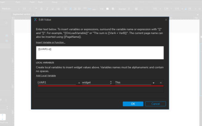
LVAR1 is a local variable and it represents the current widget that triggered the event, in Axure is referred as This widget.
If you are not really familiar with events, actions, cases you can read more about them on the Axure website https://docs.axure.com/axure-rp/reference/events-cases-actions/.
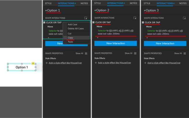
All right now that you have the interaction completed all you need is to copy/paste on the rest of the +Option widgets and that is it.
Creating a segmented control is relatively easy in Axure if you have the appropriate document structure. Now, you can use your new segmented control in future projects.
You can also download the Axure file from here: https://hi.switchy.io/1SLZ
Original post you can find here: https://uxdesign.cc/how-to-create-a-segmented-control-in-axure-rp-9-100cecd13ab2